Icons
Guidelines and best practices you should follow when designing custom icons for LEAP applications.

LEAP icons adopt a system to ensure a cleaner, more consistent and more unified look to all LEAP applications. This section will describe the guidelines and best practices you should follow when designing custom icons for LEAP applications.
Web
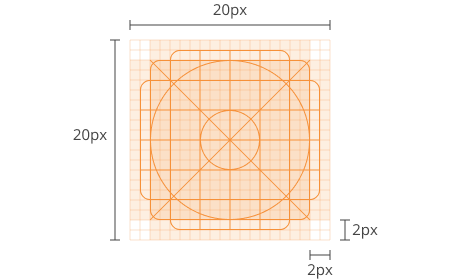
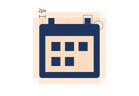
Always use the layout grid as a guideline which placing artwork elements. Centre your illustration within the 20px x 20px drawing space and allow a padding of approximately 2px from each side.
Layout Grid
20px x 20px with 2px padding
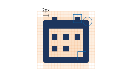
Icons should be drawn with a 2px stroke with a square cap on all ends. Use a corner radius of 2px by default. The interior corners should be square as rounded corners may reduce legibility. You may fill your icons or retain outlined icons.
Design
2px stroke, square cap, 2px corner radius
Conceptual modifiers can be used to extend the description of an icon. Modifiers should fit within the 12px x 12px drawing space on the bottom right of the icon.
Conceptual Modifier
12px x 12px
Ensure your icons are pixel perfect by placing icons on whole pixels, without any decimal points. This is to avoid distorting your illustration and to retain clarity without blur.
Prepare your icons in vector format and export them in SVG format. SVG is a vector format which allows for high resolution scaling at any screen size.
Desktop
Within the LEAP Desktop application, your custom icon may appear in the ribbon or as an action icon.
Always use the layout grid as a guideline which placing artwork elements. Icons should be redrawn for each size.
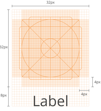
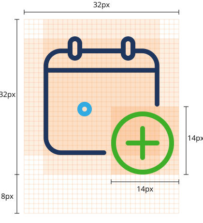
For ribbon icons, centre your illustration within the 32px x 32px drawing space and allow a padding of approximately 4px from each side. Offset the icons by 8px below the (32px x 32px) drawing space to allow empty space for the button label. Your final icon should be 32px x 40px.
Layout Grid
32px x 40px with 4px padding and 8px offset
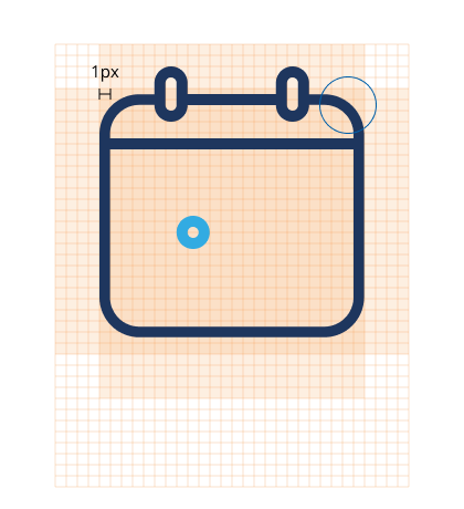
The icon should be drawn with a 1px stroke with a round cap on all ends and round joins for all corners. Use a corner radius of 1px to soften the look of any harsh angles or corners.
Design
1px stroke, round cap, 1px corner radius
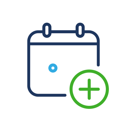
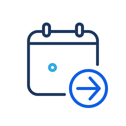
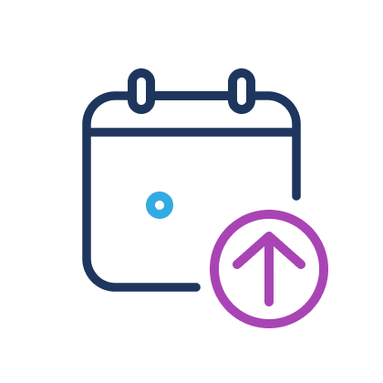
Conceptual modifiers can be used to extend the description of an icon. Modifiers should fit within the 14px x 14px drawing space on the bottom right of the icon.
Conceptual Modifier
14px x 14px
In desktop applications, LEAP has assigned colours to represent various functions of modifiers as follows:
Green
add, create, new
Blue
action, edit
Purple
make changes within
Ensure your icons are pixel perfect by placing icons on whole pixels, without any decimal points. This is to avoid distorting your illustration and to retain clarity without blur. Export your icons in PNG format without any background. PNG is a lossless data compression format which preserves transparency in your images.
iOS
Always use the layout grid as a guideline which placing artwork elements. Centre your illustration within the 28px x 28px drawing space and allow a padding of approximately 3px from each side.
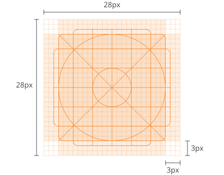
Layout Grid
28px x 28px with 3px padding
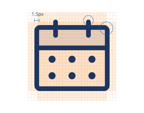
The icon should be drawn with 1.5px stroke with a round cap on all ends and round joins for all corners. Use a corner radius of 1px to soften the look of any harsh angles or corners.
Design
1.5px stroke, round cap, 1px corner radius
LEAP iOS enables two-tone icons in order to add depth and dimension to your illustration. To create the two-tone effect, select a shape within the illustration and apply a fill of 10% transparency using the same colour as the stroke.
Two Tone
10% transparency
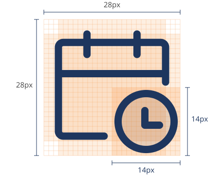
Conceptual modifiers can be used to extend the description of an icon. Modifiers should fit within the 14px x 14px drawing space on the bottom right of the icon.
Conceptual Modifier
14px x 14px
Prepare your icons in vector format and export them in PDF format. PDF is a vector format which allows for high resolution scaling across all iOS devices.
Android
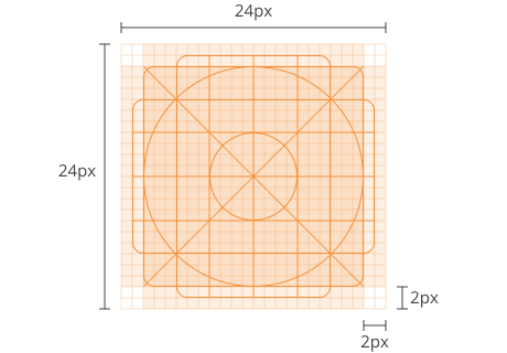
Always use the layout grid as a guideline which placing artwork elements. Centre your illustration within the 24px x 24px drawing space and allow a padding of approximately 2px from each side.
Layout Grid
24px x 24px with 2px padding
Icons should be drawn with a 2px stroke with a square cap on all ends. Use a corner radius of 2px by default. The interior corners should be square as rounded corners may reduce legibility. You may fill your icons or retain outlined icons.
Design
2px stroke, square cap, 2px corner radius
Conceptual modifiers can be used to extend the description of an icon. Modifiers should fit within the 14px x 14px drawing space on the bottom right of the icon.
Conceptual Modifier
14px x 14px
Ensure your icons are pixel perfect by placing icons on whole pixels, without any decimal points. This is to avoid distorting your illustration and to retain clarity without blur.
Prepare your icons in vector format and export them in SVG format. SVG is a vector format which allows for high resolution scaling across all Android devices.
Marketplace
Your app icon is at the forefront of marketing and recognition. It is usually the very first element that users will see. Your app icon should be simple, memorable, and capture the purpose of your LEAP app.
Every element which is displayed in our Marketplace can be controlled within the Developer Console.
To find out more, please refer to our Developer Docs on Promoting a LEAP App